

I'm Milo Trujillo, a computer and social scientist, activist, and hacker.
Blog posts cover a myriad of technical and social topics, often focused on securely organizing decentralized groups.
Model Collapse
Posted 5/29/2026
I’ve heard many people talk about model collapse recently, especially regarding Large Language Models. This is a phenomenon where training a machine learning model on the outputs of itself or other machine learning models can often degrade performance and magnify errors. In this post I want to talk a little about the phenomenon and its implications for the future of LLMs.
How does Model Collapse Work?
Let’s demonstrate the problem with one of the simplest machine learning models: linear regression. Here we have a “true function” (a cosine wave) which can only be observed noisily. This means given an X value we can observe the Y value of the cosine wave plus a small error term. We’ll gather thirty samples from random X points and try to fit a degree 3 polynomial, so fitting y = ax + bx^2 + cx^3 + d to the sampled points.
1
2
3
4
5
6
7
8
9
10
11
12
13
14
15
16
17
18
19
20
21
22
23
24
25
26
27
28
29
30
31
32
33
34
35
36
#!/usr/bin/env python3
import matplotlib.pyplot as plt
import numpy as np
from sklearn.linear_model import LinearRegression
from sklearn.preprocessing import PolynomialFeatures

# Wrap the function in a class that behaves like a sklearn predictor
class TrueFunc:
    def true_fun(self, X):
        return np.cos(1.5 * np.pi * X)
    def predict(self, X):
        X_relevant = X[:,1] # Use X, not X^0 or X^2
        return self.true_fun(X_relevant)

np.random.seed(0)
n_samples = 30
degree = 3
tf = TrueFunc()

X = np.sort(np.random.rand(n_samples))
X_rotated = X.reshape(-1, 1) # Make this an Nx1 array instead of 1xN
expanded_features = PolynomialFeatures(degree).fit_transform(X_rotated)
# Sample with noise
y = tf.predict(expanded_features) + np.random.randn(n_samples) * 0.1
# Fit a curve to the samples
reg = LinearRegression().fit(expanded_features, y)

# Plot the resulting curves across [0..1] and the sampled points
X_test = np.linspace(0, 1, 100)
X_test_rotated = PolynomialFeatures(degree).fit_transform(X_test.reshape(-1,1))
plt.figure(figsize=(6,4), dpi=120)
plt.plot(X_test, tf.true_fun(X_test), label="True Function")
plt.plot(X_test, reg.predict(X_test_rotated), label="Model")
plt.scatter(X, y, edgecolor="b", s=20, label="Samples")
plt.legend(loc="best")
plt.show()
So far so good, we’ve fit a line that approximates the original function and it does pretty well! But what happens if we noisily sample from our fit line, and try to train a degree three linear regressor on that? And then train another model off of that one?
Let’s go ahead and fit five hundred linear regression curves, each to thirty points sampled noisily from its predecessor:
1
2
3
4
5
6
7
8
9
10
11
12
13
14
15
16
17
18
19
20
21
22
23
24
25
26
27
28
modelCount = 500
models = [tf]
orig_X = []
orig_Y = []
for i in range(modelCount):
    model = models[-1]
    X = np.sort(np.random.rand(n_samples))
    X_rotated = X.reshape(-1, 1) # Make this an Nx1 array instead of 1xN
    expanded_features = PolynomialFeatures(degree).fit_transform(X_rotated)
    # Sample with noise
    y = model.predict(expanded_features) + np.random.randn(n_samples) * 0.1
    if( i == 0 ):
        orig_X = X
        orig_Y = y
    reg = LinearRegression().fit(expanded_features, y)
    models.append(reg)

plt.figure(figsize=(6,4), dpi=120)
X_test = np.linspace(0, 1, 100)
X_test_rotated = PolynomialFeatures(degree).fit_transform(X_test.reshape(-1,1))
for i in [0, 100, 200, 500]:
    model = models[i]
    if( i == 0 ):
        plt.plot(X_test, model.true_fun(X_test), label="True Function")
    else:
        plt.plot(X_test, model.predict(X_test_rotated), label="Model %d" % i)
plt.legend(loc="best")
plt.show()
As we can see, the error terms accumulate, so we drift further and further from the original function. At five hundred curves, the shape of the original function is almost entirely lost. You can’t improve linear regression by generating synthetic data points from your fit curve and then re-fitting to those.
All machine learning models, whether regressors, classifiers, or generative models, suffer from a similar challenge. The models have imperfect outputs, they predict a little too high or too low, they occasionally misclassify a point, they hallucinate1 some outputs. Therefore, training on those mistakes will magnify errors and degrade performance in nearly every domain.
There are some rare exceptions where training on synthetic data is warranted, such as imputing missing values, which I discussed in another machine learning post, or training a small and simple model to mimic the behavior of a larger and more complex model. However, even in these scenarios data scientists know that synthetic data degrades model performance, and they must carefully ensure they accomplish their goals without damaging the model to the point that it loses utility.
How Does this Apply to LLMs?
In the case of large language models our objective is to mimic human writing by ingesting an enormous volume of text and fitting to patterns in word co-occurrence. Therefore, we want to avoid training on text written by other LLMs, as this represents synthetic data points that are likely to amplify bad behaviors in our model.
Unfortunately, as LLMs have proliferated they are responsible for lots of text online, from social media comments to code commits. If you conduct large-scale web scraping you will inevitably include lots of LLM-written text, and there’s no easy way to filter it out to get a “clean” training set.
But why do we need new data? Don’t we have enough text to train LLMs? If we scrape every book in every library and all the Reddit comments, tweets, and skeets from before 20222, is that not enough?
Well, if your goal is simply to build a machine that can read and write English, then that’s fine. Train a model once, now you have an LLM you can run locally. However, we often expect models to answer questions about current events. In order to answer prompts with contemporary data, you have two options:
-
Train the model using recent text, so recent history and public figures become part of the pattern the model has observed and fit to
-
Combine the model with a secondary data source; for example, Google Search may find several recent web pages about the topic you search for, feed these to their Gemini LLM, and ask it to summarize the articles to answer your search query
The second option can help in some circumstances (especially summarizing breaking news), but there’s a limit to how much context you can feed the LLM along with each prompt, so it’s a bandaid rather than a solution to the overall problem.
Case Study: Writing Code
For an illustrative example, consider Claude Code or Microsoft’s CoPilot, LLMs trained to help write software. These models have read nearly every commit on GitHub, StackOverflow question, and whatever other source code the companies could get their hands on. The models can now write useful code, from aiding in debugging to writing a short function or SQL query, to “vibe coding” entire applications if you’re into that sort of thing. We could debate the exact quality and maintainability of LLM-written code, or the impacts this will have on software engineering as an industry and training junior engineers, but those aren’t the aspects I want to focus on today.
Two years from now there will be several new libraries or frameworks, and existing packages and websites will change their APIs. If we froze an LLM right now with its present training data, then in two years it will necessarily produce ‘stale’ code using outdated libraries and deprecated APIs. Over time, such an LLM becomes less and less useful. Eventually, it will produce code that no longer works because the surrounding environment has diverged too greatly from the training examples the model has seen.
So to keep Claude Code relevant it must be continually trained on new git commits, new StackOverflow questions. This teaches the model about new libraries and API changes, but given the proliferation of LLM-written code on GitHub it also means you are necessarily training the model on the outputs of other models.
What might you pick up by training off of LLM outputs? Well think about what mistakes LLMs make when writing code. They may replicate bugs that they observed in training commits. They may hallucinate methods or arguments to functions that don’t exist. They may replicate typos they’ve learned from, including typoed package names, leading to an explosion in typo-squatting attacks where malicious actors release malware under package names close to real packages, hoping victims will accidentally install their malware. When an LLM sees these mistakes in its training data it is more likely to make the same mistakes in the future, magnifying the likelihood of introducing bad code, bugs, and security vulnerabilities.
In short, as LLMs proliferate they will ‘contaminate’ the training pool, and make it harder and harder to build future models. These challenges may not be insurmountable - one can imagine an army of human reviewers sifting out the “good” code from the bad, or an elaborate series of sandboxes and unit tests to try to improve automatic detection of bugs - but they will certainly prove difficult to overcome.
Footnotes
-
I think “hallucinate” is a misnomer, and it would be more appropriate to say that generative models are always hallucinating and sometimes those hallucinations are incidentally accurate or useful. Generative models lack a view or understanding of the world sufficient to differentiate fact from fiction, they simply generate plausible-looking outputs based on training data. Sometimes those outputs “look right” to humans, and when they “look wrong” we call it a hallucination, but there’s no functional difference to the machine. However, that’s a tangent that’s not helpful here, so we’ll stick with the accepted term. ↩
-
I like comparing pre-LLM text to the low-background steel problem, wherein we have contaminated the atmosphere after nuclear bomb tests such that all steel contains trace radioactive elements. When building particularly radiation-sensitive equipment, such as Geiger counters or particle detectors, we use metal produced before the atomic tests that has been subsequently shielded from fallout. Often this means harvesting metal from pre-1940s shipwrecks! ↩
The Journalist/Academic Leaked Data Divide
Posted 3/13/2026
I am presently flying back from a workshop where academics, journalists, and NGOs discussed how to build collaborations between the three when studying leaked documents, and particularly when studying leaked financial data. Here I’m sharing some of my takeaways. There were many parties at this workshop, but under the Chatham House Rule I will not attribute anyone’s statements to a particular party, and I’ll phrase things mostly from my own organization’s perspective.

At Distributed Denial of Secrets we publish a great deal of leaked information in the public interest. But millions of dumped spreadsheets and emails and PDFs aren’t very useful without an expert extracting a narrative from them. We primarily work with journalists: sharing data with them, providing search engines (here and here for example) and analysis tools (like this, this, or this) to make analyzing leaked data easier, and when we have an established relationship with journalists, alerting them to releases on their beat or facilitating collaborations and embargoes between parties. In principle we would like to work with academic researchers, too, in hopes they extract different insights from the same data. Many academics reach out to us for data access with initial excitement. However, aside from a few notable success stories, we have seen very few academic publications from our data. So where are academic studies breaking down?
Academic Value
First, why work with academics? Well, there’s complementary skill sets: journalists may be better equipped to read leaked memos and emails to piece together significant players in a company, while a computer or data scientist might be better equipped to understand a database dump or build timelines of financial transactions or run network analysis to find hubs and bridges in communication. Media groups increasingly have data journalists on staff to bridge this gap, but they remain far from ubiquitous.
But the bigger contribution is a difference in focus, which I’ll reductively refer to as depth versus breadth. Journalists are interested in a smoking gun, a memo that reveals a conspiracy and tells a clear story, and pursue those documents with great zeal in interviews and archival work. Academics are typically more interested in patterns of behavior, and so may be interested in the most banal documents that journalists pass over to paint a picture of what is normal in a data set.
As one example, consider the 2019 publication of BlueLeaks. This was a hack of NetSential, the Google Drive-like service used by opaque cross-jurisdictional counter-terrorism fusion centers. The leak revealed internal memos, emails, training documents, and, for some fusion centers, access logs of what accounts created or read what files at what time. There were hundreds of media articles on individual memos that revealed racist and homophobic police training, data sharing agreements with Google, highly questionable phone record access, and much, much more. But the academic work on BlueLeaks instead focused on categorizing documents in the Boston and Maine fusion centers, demonstrating how over 80% of memos (and most of the highly accessed memos) were about local drug and property crime that was far outside the mandate of a counter-terrorism unit.

When this study was compiled with data from local activists into the MIAC shadow report and presented to the state legislature, they found this systemic argument compelling and passed a series of transparency laws aimed at reigning in their fusion center. The process was slow: the academic study itself took the better part of a year, and the legislature has been passing new iterations of their fusion center regulation from April 2021 through February of 2026. Nevertheless, media coverage of fusion center practices did not spark the same kind of legislative reform, so these systemic studies are a uniquely valuable lever that should not be overlooked.
The Exploration Problem
The idealized scientific method goes “develop a hypothesis, devise an experiment for testing the hypothesis, gather data needed to evaluate the test, run the test, evaluate results, reject or fail to reject hypothesis.”
Reality is much more complicated. Part way through examining data the hypotheses often evolve, and there’s some push-pull between questions driving the collection of data and the contents of data driving a refining of the questions.
When working with leaked data however, the process is inverted: we don’t know ahead of time what’s in the documents, our only choice is to fumble around for a while until we gain familiarity with the data set and what questions it might be able to answer. In some qualitative academic traditions, like ethnography and inductive coding, this kind of exploratory data analysis is ubiquitous. In quantitative fields, however, exploratory data analysis is frequently discouraged, because you can invest a lot of time exploring data without seeing any results.
There’s no way to totally sidestep this problem: working with leaked data requires exploration. However, there are a number of ways we can lower the barrier to entry, including aggregated existing media coverage of a dataset (see again the BlueLeaks entry at DDoSecrets), better categorization of data (such as clearly tagging our releases as “financial data”, “SQL dump”, to flag which researchers the release might be relevant to and what skills they’ll need to access it), and maybe summaries akin to machine learning’s model cards or more recent network cards.
The IRB Challenge
Journalists may run their stories past in-house legal counsel or ethics committees. Academics likewise submit their research proposals to a review board (the Institutional Review Board (IRB) in the United States, Ethics Review Boards (ERB) in Europe, Research Ethics Boards (REB) in Canada, similar idea in all cases) when their research contains human subjects. These boards have the dual purposes of following ethical standards regarding potential harm to subjects, and insulating the institute from legal risk.
I do not believe that ethical standards are different between academia and journalism. Responsible reporting balances the value of public knowledge and the risk to the people being reported on, and this is true whether the report is scientific or investigative journalism. However, there is a lot more precedence for journalists working with leaked data than academics, so getting IRB approval can be a difficult sell.
There are a few responses to this:
-
This challenge will fade on its own over time. As we conduct more data science studies of leaked documents there will be stronger precedence for this kind of work, more example ethics statements to draw from, and review boards more familiar with these types of studies.
-
We can learn from our colleagues in fields with very extensive ethical framework requirements, like medical researchers. We can carefully describe exactly how data will be used, what will be published, what will be withheld, and how this presents risks to people in the leaked documents and liability to researchers and the institute. We can draw from existing ethical standards at academic associations like the ACM or publications like the Associated Press. This should not be seen as tedious or a checkbox, but a responsible part of methodological design. If it requires several pages and its own literature review, so be it.
-
Not every study requires IRB approval. In particular, computer scientists are notorious for carefully defining “human subjects” and “implied consent” to make their studies IRB-exempt. This tradition comes from studying newspaper articles, where the written output of a human doesn’t qualify as a “human subject,” and publishing the articles in a paper of record implies that we have consent to read the articles. This argument is frequently extended to encompass studies of social media data, and it can be extended to studying leaked documents that have already been made public, especially if they contain limited human data. However, this is a risky choice: when an institute gives IRB approval to a study they not only confirm that they believe the study is ethical, but they agree to assume legal liability for the study should the researchers be sued. Forgoing IRB approval exposes researchers to potential legal risk instead.
From DDoSecrets’ perspective, we can streamline this process for researchers by compiling prior academic studies using our data and common arguments made to review boards – and we can collaborate with other like-minded institutions to build this resource.
Collaborative Differences
When we talk about getting journalists and academics to study leaked data we can be referring to two things:
-
Journalists studying data, followed by academics
-
Journalists studying data in collaboration with academics
The former is simpler: journalists explore a dataset, working quickly to publish stories before the news cycle moves on. Academics then descend on the data, using the media coverage as an initial map of what’s in the leaked documents, and working on their own typically slower schedule. Academics have some time pressure, too - they want to publish before they get scooped by other researchers, or may be on a schedule bound by grant funding or student availability by semester - but are typically under less time crunch than their journalistic counterparts.
True collaboration is more challenging. Different timelines, different skill sets, and most of all different epistemologies. Nevertheless, I’ve spoken with several teams that have successfully integrated researchers and journalists on projects. They reported that often this looks like two studies conducted in parallel, where the journalists cite the researchers as expert testimony, while the researchers can cite the media coverage in their literature review and discussion of results.
There is a tension in how both parties present methodology. As scientists, we are trained to be as precise as possible, detailing exactly how we take measurements and what caveats should be expected. This can be quite verbose, and impenetrable with technical details and math. By contrast, journalists are reporting to a more general audience, and want as concise and easily explainable a methodology as possible. This difference can prove frustrating, and journalists have been annoyed interviewing me when I choose words carefully and am cautious about what I state we can “know.” However, collaborating can provide a loophole: journalists can report on scientific conclusions, citing the researchers, and abstract away the methods from their audience.
Financial Collaboration
In any collaboration someone needs to foot the bill for both the journalists’ and academics’ time. Sometimes interests align and the academics and journalists have independent sources of funding, but we’ll put that perfect case aside. Academic grants rarely include funding for journalists (although I think this is an interesting avenue to pursue when funding agencies want to see impact and outreach – you get a lot more eyes on news coverage than academic papers), so we have more examples of journalists contracting with academics. This can take two main forms:
-
The journalists hire the academics as independent researchers. Academics frequently take consulting gigs with industry partners, so this is well-established practice. However, the academics will not be working in their capacity with the university, and so will not have access to university resources such as supercomputing time or journal access.
-
The journalists contract with the university for support. Now the academics will be working for the journalists as part of their day job, and therefore have access to all the university’s resources. However, the university is also likely to take significant overhead costs, much like with research grants.
It may be possible to combine both of the above. For example, the journalists pay for the researcher’s time as a contractor, but the researcher pays for supercomputing time from a relevant grant. One option here is an outreach budget - especially in Europe, labs are often supported by broad grants covering many researchers, which sometimes have a section dedicated to public outreach. Working with journalists to put a study in the eyes of the public can be justified under this umbrella, and so supercomputing time to further such a project can be framed as a component of outreach, tapping an otherwise underutilized portion of the budget.
Closing Thoughts
Leaked data provides unprecedented insights into organizations and individuals, and can be invaluable for journalistic and academic studies. Because of the volume and variety of data, a wide range of skills are needed to make sense of it. Therefore, we are likely to see increasingly diverse research teams, blurring the lines between disciplines to pursue truth as effectively as possible. These collaborations will be challenging at first, crossing a number of methodological and knowledge-producing boundaries, but I am confidently these hurdles can and will be overcome.
A Machine Learning Crash Course
Posted 2/28/2026
I am currently teaching a masters level course on network science. We spent one afternoon on a rapid survey of machine learning to introduce students to concepts and tools that can expand their skill sets. I thought it’d make for a good self-contained blog post, so I’ve repurposed the lecture below.
What is Machine Learning?
Machine learning describes a set of statistical techniques for finding predictive patterns in data. Typically, we will have one or more input variables (called features or predictors and denoted X) and one output variable (sometimes called a response variable or a label, denoted y).
Machine learning can be broken into two broad categories, supervised and unsupervised:
-
In supervised machine learning we have a series of input data and are trying to find a relationship between multiple features and a known label. For example, “here are labeled photos of cats and dogs, build a machine that can distinguish between the two,” or “we are a life insurance company: based on these spreadsheets of health information and age at death, predict lifespan for future subjects.”
-
In unsupervised machine learning we do not have any ground truth labels, and are trying to fit the best pattern possible. For example, clustering, dimensionality reduction, missing value imputation, or outlier detection. Most community detection algorithms from network science fall into this category.
In this post we will primarily be focusing on supervised machine learning. Supervised tasks can be broken into two further categories:
-
Classification: produce a categorical label from input data (i.e. “predict whether this is a photo of a cat or a dog”)
-
Regression: produce a numeric prediction from input data (i.e. “predict lifespan,” “predict bird beak length”, etc)
Both tasks are closely related, so the algorithms for classification and regression are often quite similar, but model performance is measured a little differently because classification has discrete outputs while regression outputs are continuous.
Linear Regression
Let’s jump in with an example that will motivate more theory. Linear regression: fitting a line to some data. You may have done this with a straight line predicting Y from X since high school or even earlier. We’re doing it again in Python!
We’ll define a “true function” with a nice sinusoidal curve, and draw a few points from that function with noise. Then we’ll try to fit a line to those noisy points to capture the original function. We’ll be making heavy use of Python’s “Scikit-Learn” package, abbreviated sklearn, along with the Numerical Python (numpy) package and MatPlotLib.
1
2
3
4
5
6
7
8
9
10
11
12
13
14
15
16
17
18
19
20
21
22
23
24
25
26
27
28
29
30
31
32
33
34
#!/usr/bin/env python3
import matplotlib.pyplot as plt
import numpy as np
from sklearn.linear_model import LinearRegression

# Adapted from https://scikit-learn.org/stable/auto_examples/model_selection/plot_underfitting_overfitting.html

def true_fun(X):
    return np.cos(1.5 * np.pi * X)

np.random.seed(0)
n_samples = 30

X = np.sort(np.random.rand(n_samples))
X_rotated = X.reshape(-1, 1) # Make this an Nx1 array instead of 1xN
y = true_fun(X) + np.random.randn(n_samples) * 0.1 # True function with a little noise

reg = LinearRegression().fit(X_rotated, y)
score = reg.score(X_rotated, y)

# Use one hundred points from 0..1 to plot our model and the original function
X_test = np.linspace(0, 1, 100)
X_test_rotated = X_test.reshape(-1,1)
plt.figure(figsize=(6,4), dpi=120)
plt.plot(X_test, reg.predict(X_test_rotated), label="Model")
plt.plot(X_test, true_fun(X_test), label="True Function")
plt.scatter(X, y, edgecolor="b", s=20, label="Samples")
plt.xlabel("x")
plt.ylabel("y")
plt.xlim((0,1))
plt.ylim((-2,2))
plt.title("$R^2$ of %.3f" % score)
plt.legend(loc="best")
plt.show()
Here we’ve fit a straight line to data points drawn from a curve. The line is not an especially good match. What if instead of providing x as an input, we provide x, x^2, x^3, and so on up to an arbitrary degree? This should let us fit a curve instead of a straight line:
1
2
3
4
5
6
7
8
9
10
11
12
13
14
15
16
17
18
19
20
21
22
23
24
from sklearn.linear_model import LinearRegression
from sklearn.preprocessing import PolynomialFeatures

degrees = [2, 4, 15]

fig, axs = plt.subplots(1, 3, figsize=(14,5), sharex=True, sharey=True)
for i,degree in enumerate(degrees):
    ax = axs[i]
    expanded_features = PolynomialFeatures(degree).fit_transform(X_rotated)
    reg = LinearRegression().fit(expanded_features, y)
    score = reg.score(expanded_features, y)

    X_test = np.linspace(0, 1, 100)
    X_test_rotated = PolynomialFeatures(degree).fit_transform(X_test.reshape(-1,1))
    ax.plot(X_test, reg.predict(X_test_rotated), label="Model")
    ax.plot(X_test, true_fun(X_test), label="True Function")
    ax.scatter(X, y, edgecolor="b", s=20, label="Samples")
    ax.set_xlabel("x")
    ax.set_ylabel("y")
    plt.xlim((0,1))
    plt.ylim((-2,2))
    ax.legend(loc="best")
    ax.set_title("Degree %d\n$R^2$ = %.3f" % (degree,score))
plt.show()
What’s going on?
With a polynomial of degree 1, we’re fitting y = mx + b, where linear regression is tuning two variables to our data: m and b. In order to fit our line to data we need some metric of how good a fit we have, commonly called a loss function or error function. Common choices are mean-squared error (MSE), and mean-absolute error (MAE). Above we’re using MSE, where error = sum(true_y - predicted_y)**2. This minimimizes the importance of small errors, and magnifies the importance of large errors. We adjust m and b experimentally until we find the lowest possible error score.
Note that rather than displaying MSE directly, we present it as an R^2 score, which is defined as 1 - u/v where u is MSE and v is sum (true_y - mean_y)**2. This ranges from (-infinity,1] where 1 is a perfect score and 0 is “guesses the mean answer for every input.”
When we increase the degree of the polynomial to 4, we are now fitting a separate “feature weight” or importance score to each input:
This is a generalization of our original y = mx + b with a separate weight for each input feature. In this case our features are x, x^2, and so on, but they could be independent variables. Now there are many more knobs to tune, but we still have a linear combination of input variables to fit a curve. With a degree of four we can make a curve very close to the original input function, greatly improving our model’s predictive power.
So what went wrong in the third figure? When we increase the model degree to 15 we now have an enormous number of knobs to tune. By carefully adjusting the parameters we can tweak our curve to pass through almost every point directly, increasing our score even further! But our curve looks nothing like the original function. We have overfit to the training data, losing sight of the pattern we’re trying to capture in favor of getting the highest possible score.
A significant challenge in machine learning is optimizing your model to get the highest predictive power possible without overfitting. We have many tools at our disposal to detect and inhibit overfitting. We will cover some of them later. (If you are shaking your computer screen screaming about train/test splits, we’re building up to it!)
Logistic Regression
For now let’s turn our focus towards a classification problem instead of a regression problem. Logistic regression fits a line to input variables much like linear regression. However, we’re going to fit a logistic sigmoid function with the form:
This produces an S-shaped curve where the y-value ranges from 0 to 1. For binary classification (distinguishing between two categories) we can treat 0 as the first category, 1 as the second category, and any value in-between as a degree of uncertainty:
We can interpret this curve as telling us “the probability that the data point is in category 1 is p(x), and the probability that the data point is in category 2 is 1 - p(x).” Therefore, probabilities sum to 1, because there is a 100% chance of the data point belonging to some category.
If we have more than two categories we must use multinomial logistic regression. (Organ music plays) Here we have multiple S-shaped curves, and the probabilities across all curves must sum to one. For a given category i this can be expressed as:
This is basically just a normalized version of ordinary logistic regression. Now let’s apply this theory to the Iris dataset. This is a classification dataset containing three kinds of irisis (Setosa, Versicolour, and Virginica). For each flower, we’ve recorded the sepal length and width, and the petal length and width, giving us four numeric features in centimeters and 150 example flowers.
1
2
3
4
5
6
from sklearn.datasets import load_iris
X, y = load_iris(return_X_y=True)
print("Five example flowers:")
print(X[:5,:])
print("The categorical labels for all flowers:")
print(y)
Five example flowers:
[[5.1 3.5 1.4 0.2]
 [4.9 3.  1.4 0.2]
 [4.7 3.2 1.3 0.2]
 [4.6 3.1 1.5 0.2]
 [5.  3.6 1.4 0.2]]
The categorical labels for all flowers:
[0 0 0 0 0 0 0 0 0 0 0 0 0 0 0 0 0 0 0 0 0 0 0 0 0 0 0 0 0 0 0 0 0 0 0 0 0
 0 0 0 0 0 0 0 0 0 0 0 0 0 1 1 1 1 1 1 1 1 1 1 1 1 1 1 1 1 1 1 1 1 1 1 1 1
 1 1 1 1 1 1 1 1 1 1 1 1 1 1 1 1 1 1 1 1 1 1 1 1 1 1 2 2 2 2 2 2 2 2 2 2 2
 2 2 2 2 2 2 2 2 2 2 2 2 2 2 2 2 2 2 2 2 2 2 2 2 2 2 2 2 2 2 2 2 2 2 2 2 2
 2 2]
Let’s fit logistic regression to the data, and then ask it to classify the first two flowers:
1
2
3
4
5
6
7
8
from sklearn.linear_model import LogisticRegression
clf = LogisticRegression(random_state=0,max_iter=1000).fit(X,y)
print("Predicted labels for first two flowers:")
print(clf.predict(X[:2, :]))
print("Probabilities for each class for first two flowers:")
print(clf.predict_proba(X[:2, :]))
print("Accuracy across all flowers:")
print(clf.score(X, y))
Predicted labels for first two flowers:
[0 0]
Probabilities for each class for first two flowers:
[[9.81567923e-01 1.84320627e-02 1.44928093e-08]
 [9.71336447e-01 2.86635225e-02 3.01765481e-08]]
Accuracy across all flowers:
0.9733333333333334
Both of the first flowers are category zero (Iris Setosa), and we can see that the model was 98 and 97% confident of both classifications, respectively. It predicted 2-3% odds that the flowers might be Iris-Versicolour, but effectively no chance of Iris-Virginica. In general, the model classifies 97% of all flowers correctly.
What is a ‘Good’ classifier?
A perfect classification model labels every data point correctly. But what if our model is only pretty good? How do we describe how good it is? We have a great many metrics to choose from. Common choices include accuracy, recall, false positive rate, precision, F1-score, ROC-AUC, and MCC. Here’s a description of each, where TP, TN, FP, and FN represent true positives and negatives, and false positives and negatives, respectfully:
-
Accuracy: correct classifications / total classifications, or
(TP + TN)/(TP + TN + FP + FN) -
Recall: correct positives / all positives, or
TP / (TP + FN), “how many of the positives did we find?” -
False Positive Rate (FPR): incorrect negatives / all actual negatives, or
FP / (FP + TN) -
Precision: correct positives / everything marked as positive, or
TP / (TP + FP), “when we marked something as positive, how often were we right?” -
F1 score (balanced F-score):
(2 * TP) / (2 * TP + FP + FN), harmonic mean of precision and recall -
ROC-AUC (Area under the curve from a Receiver Operating Characteristics curve)
-
Matthews correlation coefficient (MCC):
(TP * TN - FP * FN) / sqrt((TP + FP)(TP + FN)(TN + FP)(TN + FN))
Why so many? Because a ‘good’ model is context-dependent. In a medical test, maybe we care about identifying sick people for treatment, and accidentally treating a few healthy people is preferable to missing a few sick people. For your spam filter, maybe you’ll be a little annoyed if an occasional spam email lands in your inbox, but you’ll be very annoyed if an important email goes into your spam folder unnoticed.
In addition to the subjective importance of false positives and false negatives, some of the scores above suffer under class imbalance. In the iris dataset we have three classes of irisis, and they are equally represented (50 each). But what if 80% of the flowers were Iris Virginica? You’ll now get very skewed values, where a high accuracy score may not mean much - if you always guess Iris Virginica you’ll get 80% accuracy! With imbalanced datasets we typically prefer the F1 score or MCC, which are more robust but less intuitive.
Decision Trees
Linear and logistic regression are both line-fitting algorithms. We will now introduce a different family of machine-learning approaches: decision trees. This is set of algorithms that sub-divides your dataset into small regions, ultimately producing a flowchart to yield predictions. Decision trees are referred to as classification trees when used for classification, and regression trees when used for regression, but the techniques are almost identical.
Let’s begin with a dataset of blue squares and orange circles (our categorical labels), each of which have an X and Y value.
We now try to place a vertical line that best separates the squares and circles, and a horizontal line that best separates the classes. We’ll keep whichever line works best.
The right partition contains only blue squares, so we’re done processing it. The left partition can be further sub-divided, so we repeat the process recursively. First we add another vertical line:
Then we add a horizontal line:
Now that the full data set is divided into partitions, the model uses these partitions for prediction. For any given X and Y values, identify the partition containing that value, and return the mode of the training data points within the partition. This can be generalized from two dimensions to an arbitrary number (although it becomes far more challenging to visualize, of course): we just look for a line along each axis that creates a partition where the variance within partitions is low, and the variance across partitions is high.
We can define several stopping conditions for building our tree. Maybe we stop once a partition has below three data points in it. Maybe we stop at a maximum depth of four. Maybe we stop once most or all of the points in a partition have the same label.
Here’s the above decision tree implemented with sklearn:
1
2
3
4
5
6
7
8
9
10
11
12
13
14
15
16
17
from sklearn.tree import DecisionTreeClassifier, plot_tree
X = [
    [2, 4],
    [3, 5],
    [3, 2],
    [1, 1],
    [5, 1],
    [6, 3],
    [6, 4],
    [7, 2]
    ]
y = [1, 0, 0, 0, 0, 1, 1, 1]

clf = DecisionTreeClassifier()
clf = clf.fit(X, y)
plot_tree(clf, feature_names=["X", "Y"], class_names=["Red", "Blue"], filled=True, rounded=True, impurity=False, fontsize=10)
plt.show()
The plot_tree function can export our decision tree as a flowchart:
This is magnificent! If neural networks are a black box where it’s difficult to understand how the model comes to a conclusion, decision trees are the inverse, where it is transparently clear how decisions are made. My mantra: if your machine learning task is simple enough to solve with a flowchart, then you should always solve it with a flowchart. You’d be surprised how many times a seemingly-complicated machine learning problem can be solved with a few if-statements - sometimes heuristics work great!
Regression Trees
When applying decision trees to regression problems instead of classification problems, the algorithm is almost identical. As with classification trees, regression trees divide data points into partitions that maximize variance between the partitions, and minimize variance within the partitions. However, the regression tree predicts values using the mean of the points within a partition, while a classification tree uses the mode. We also measure performance differently for classification and regression trees - for classification we’ll use accuracy or recall or any of the metrics defined above, while regression will use a loss function like “mean squared error” as in the linear regression example.
Classifying Irises using Trees
For a more involved example, let’s throw decision trees at the Iris dataset. We’ll limit trees to depth of 2, 3, and 5, report the accuracy score of each, and then plot the depth-3 tree:
1
2
3
4
5
6
7
8
9
10
11
12
13
14
15
16
17
18
19
20
21
22
23
from sklearn.tree import DecisionTreeClassifier, plot_tree
from sklearn.datasets import load_iris
X, y = load_iris(return_X_y=True)

trees = []

for max_depth in [2, 3, 5]:
    clf = DecisionTreeClassifier(
        max_depth=max_depth,
        min_samples_split=2,
        min_samples_leaf=1,
        min_impurity_decrease=0.005,
        max_leaf_nodes=None
    ).fit(X, y)
    score = clf.score(X, y)
    print("Max-depth %d has an accuracy of %.3f" % (max_depth,score))
    trees.append(clf)

feature_names = ["Sepal Length", "Sepal Width", "Petal Length", "Petal Width"]
class_names = ["Iris-Setosa", "Iris-Versicolour", "Iris-Virginica"]
plt.figure(figsize=(14, 5), dpi=120)
plot_tree(trees[1], feature_names=feature_names, class_names=class_names, filled=True, rounded=True, impurity=False, fontsize=10)
plt.show()
Max-depth 2 has an accuracy of 0.960
Max-depth 3 has an accuracy of 0.973
Max-depth 5 has an accuracy of 0.993
Summarizing the tree: if the Iris has narrow petals, it’s Iris-Setosa. Otherwise, if the petals are very wide, it’s Iris-Virginica. In the less clear intermediate region, if the petals are long it’s probably Iris-Virginica, and if the petals are shorter it’s almost certainly Iris-Versicolour. Logistic regression couldn’t explain its decision-making process this way!
Notice that I’ve added an extra boundary condition: min_impurity_decrease. This restricts the tree so that we don’t divide partitions unless the new cut significantly improves variance scores. This prevents the tree from sub-dividing the rightmost Iris-Virginica partition to try and separate out that single Iris-Versicolour sample in the bin.
Fitting a Regression Tree to a Curve
Let’s return to our linear regression problem, but this time face it with regression trees:
1
2
3
4
5
6
7
8
9
10
11
12
13
14
15
16
17
18
19
20
21
22
23
24
25
26
27
28
29
30
31
32
33
34
35
36
37
38
39
40
41
42
43
44
from sklearn.tree import DecisionTreeRegressor, plot_tree

def true_fun(X):
    return np.cos(1.5 * np.pi * X)

np.random.seed(0)
n_samples = 30

X = np.sort(np.random.rand(n_samples))
X_rotated = X.reshape(-1, 1) # Make this an Nx1 array instead of 1xN
y = true_fun(X) + np.random.randn(n_samples) * 0.1 # True function with a little noise

X_test = np.linspace(0, 1, 1000)
X_test_rotated = X_test.reshape(-1,1)

plt.clf()
trees = []
fig, axs = plt.subplots(1, 3, figsize=(14,5), sharex=True, sharey=True)
for i,max_depth in enumerate([2, 3, 7]):
    reg = DecisionTreeRegressor(
        max_depth=max_depth,
        min_samples_split=2,
        min_samples_leaf=1,
        max_leaf_nodes=None
    ).fit(X_rotated, y)
    trees.append(reg)

    score = reg.score(X_rotated, y)

    ax = axs[i]
    ax.plot(X_test, reg.predict(X_test_rotated), label="Model")
    ax.plot(X_test, true_fun(X_test), label="True Function")
    ax.scatter(X, y, edgecolor="b", s=20, label="Samples")
    ax.set_xlabel("x")
    ax.set_ylabel("y")
    plt.xlim((0,1))
    plt.ylim((-2,2))
    ax.legend(loc="best")
    ax.set_title("Max Depth %d\n$R^2$ = %.3f" % (max_depth,score))

plt.show()
plt.figure(figsize=(14, 5), dpi=120)
plot_tree(trees[1], feature_names=["X"], filled=True, rounded=True, impurity=False, fontsize=10)
plt.show()
This lets us plot example performance with several regression trees of different depths:
First, this is clearly much blockier than linear regression, and does not neatly capture the original function. Nevertheless, we get a decent R^2 score, especially as we increase the tree depth and begin mercilessly overfitting to training data.
Let’s examine the depth three tree in more detail:
As we can see, the tree simply bins the training data points and predicts one of eight values. A clumsy heuristic, but it’s performed well enough so far. Note that this strategy will not work if we apply our decision tree to any X values not well represented in the training data. With linear regression, we can fit our degree 4 polynomial to the original function and effectively predict what the function will likely do for an X value of 1.2 - but our regression tree will simply return the value of its highest bin and guess -0.2 for all X values above 0.935! Terrible!
Limitations of Trees
Trees are wonderful for their simplicity and explainability, their ability to easily work with categorical features, and their robustness to features of different scales. Truly a wonderful technique. Unfortunately, they do have a number of downsides:
-
They are prone to overfitting, and must be carefully constrained
-
They are bad at extrapolation: linear regression can predict a y-value based on a trajectory from a known data point, while decision trees can only bin y-values to the closest data point in their training set
-
They can produce poor trees for heavily biased datasets
For the above reasons decision trees are rarely used on their own in production applications of machine learning. They are however, often used as components of more sophisticated algorithms.
Random Forests
What do we do when trees overfit? Add more trees!!
Decision trees are prone to overfitting. One solution to this problem is to create multiple decision trees, each fit on a subset of the available features and training data. Each tree may overfit to the training data, but they’ll overfit in different ways. We can average the predictions from each tree and get a superior aggregate result. We call this collection of random-feature trees a Random Forest. In general, models that average the results of other models are called ensemble models.
Random forests perform much better than trees. While they typically don’t quite match more advanced approaches like deep neural networks or generative AI, they are simple and computationally much cheaper. For this reason they are often included as a baseline when measuring the performance of more advanced models, and random forests are still often deployed for their better performance / cost ratio.
Trees and forests also have one last advantage: they can easily report how useful each feature was in prediction. We’ll demonstrate this by applying Random Forests to another classic dataset: predicting who survived the sinking of the Titanic. In this problem we have a number of input features - some categorical, such as sex or passenger class, some numeric, like age or ticket cost - and we are fitting a binary classifier to answer “is a given passenger likely to survive?”
For now, please gloss over the Ordinal Encoding and Imputation lines; we will return to them later. Suffice to say they’re cleaning up a messy dataset and preparing the inputs in a format better-suited to machine learning.
1
2
3
4
5
6
7
8
9
10
11
12
13
14
15
16
17
18
19
20
21
22
23
24
25
26
27
28
29
30
31
32
33
34
35
# Adapted from https://scikit-learn.org/stable/auto_examples/inspection/plot_permutation_importance.html

from sklearn.datasets import fetch_openml
from sklearn.compose import ColumnTransformer
from sklearn.preprocessing import OrdinalEncoder
from sklearn.impute import SimpleImputer
from sklearn.ensemble import RandomForestClassifier

X, y = fetch_openml("titanic", version=1, as_frame=True, return_X_y=True)

categorical_columns = ["pclass", "sex", "embarked"]
numerical_columns = ["age", "sibsp", "parch", "fare"]
# Reorder columns and drop irrelevant data
X = X[categorical_columns + numerical_columns]

categorical_encoder = OrdinalEncoder(handle_unknown="use_encoded_value", unknown_value=-1, encoded_missing_value=-1)
numerical_pipe = SimpleImputer(strategy="mean")
preprocessing = ColumnTransformer(
    [
        ("cat", categorical_encoder, categorical_columns),
        ("num", numerical_pipe, numerical_columns),
    ],
    verbose_feature_names_out=False,
)

X = preprocessing.fit_transform(X)

rf = RandomForestClassifier(n_estimators=100, random_state=0)
rf.fit(X, y)

feature_names = categorical_columns + numerical_columns
mdi_importances = pd.Series(rf[-1].feature_importances_, index=feature_names).sort_values(ascending=True)
ax = mdi_importances.plot.barh()
ax.set_title("Random Forest Feature Importances\nBy Mean Decrease in Impurity")
plt.show()
We can’t get a nice flowchart out of our forest, because the forest is averaging one hundred decision trees, each of which have a handful of features to work with. However, the above plot tells us that sex and age were the most helpful features for determining survivability, followed by fare, followed distantly by everything else. In other words, “women and children first, and the lifeboats were on the upper decks near the higher-paying travelers.”
Note that the above features are not necessarily independent. We can imagine a scenario where most of the women and children on the boat were higher-paying travelers, while the lower decks were filled with male immigrants seeking work. In this case, there may be some overlapping information between sex, age, and fare, but we can fit to the decision problem nevertheless. Likewise, we might expect that ticket fare and passenger class correlate, but ticket price had a higher resolution and provided a better signal than passenger class alone, and so was favored in any tree with access to both.
Train / Test Splits
So far we have trained our models on all of our example data points, and then measured the model’s performance by how well it predicts those same data points. This is a recipe for disastrous overfitting. The model can easily memorize all inputs and achieve perfect accuracy that’s useless in the real world! We’ve seen examples of this already with degree-15 linear regression and depth-7 regression trees.
Instead, we typically want to train on some data points, and test performance on a second set of points. How many? It’s a tradeoff: more training data will improve our model, but we want to withhold enough data for testing to be confident about our model performance.
One unprincipled and clumsy rule of thumb is the 80-20 split: use 80% of our data for training, 20% for testing. Let’s give it a shot! Starting with the line-fitting problem once again:
1
2
3
4
5
6
7
8
9
10
11
12
13
14
15
16
17
18
19
20
21
22
23
24
25
26
27
28
29
30
31
32
33
34
35
36
37
38
39
40
41
42
43
44
45
46
47
48
49
50
51
52
53
from sklearn.linear_model import LinearRegression
from sklearn.tree import DecisionTreeRegressor
from sklearn.preprocessing import PolynomialFeatures
from sklearn.model_selection import train_test_split

def true_fun(X):
    return np.cos(1.5 * np.pi * X)

np.random.seed(0)
n_samples = 40
linear_regression_polynomial = 2
tree_depth = 7

X = np.sort(np.random.rand(n_samples))
y = true_fun(X) + np.random.randn(n_samples) * 0.1 # True function with a little noise
X_rotated = X.reshape(-1, 1)

# 80/20 train/test split
X_train, X_test, y_train, y_test = train_test_split(X_rotated, y, train_size=0.8)

# Expand train and test X for linear regression
train_expanded_features = PolynomialFeatures(linear_regression_polynomial).fit_transform(X_train)
test_expanded_features = PolynomialFeatures(linear_regression_polynomial).fit_transform(X_test)

# Fit both models
lreg = LinearRegression().fit(train_expanded_features, y_train)
treg = DecisionTreeRegressor(max_depth=tree_depth).fit(X_train, y_train)

# Get R^2 for train and test sets
lin_train_score = lreg.score(train_expanded_features, y_train)
lin_test_score = lreg.score(test_expanded_features, y_test)
treg_train_score = treg.score(X_train, y_train)
treg_test_score = treg.score(X_test, y_test)

X_plot = np.linspace(0, 1, 1000)
X_plot_rotated = X_plot.reshape(-1,1)
X_plot_expanded = PolynomialFeatures(linear_regression_polynomial).fit_transform(X_plot_rotated)

fig, axs = plt.subplots(1, 2, figsize=(14,5), sharex=True, sharey=True)
axs[0].plot(X_plot, lreg.predict(X_plot_expanded), label="Linear Regression")
axs[1].plot(X_plot, treg.predict(X_plot_rotated), label="Regression Tree")
for i in [0,1]:
    axs[i].plot(X_plot, true_fun(X_plot), label="True Function")
    axs[i].scatter(X_train.reshape(-1, 1), y_train, edgecolor="b", s=20, label="Training Samples")
    axs[i].scatter(X_test.reshape(-1, 1), y_test, edgecolor="r", s=20, label="Testing Samples")
    axs[i].set_xlabel("X")
    axs[i].set_ylabel("Y")
    axs[i].legend(loc="best")
axs[0].set_title("Linear Regression train $R^2$ %.3f Test $R^2$ %.3f" % (lin_train_score, lin_test_score))
axs[1].set_title("Regression Tree train $R^2$ %.3f Test $R^2$ %.3f" % (treg_train_score, treg_test_score))
plt.xlim((0,1))
plt.ylim((-2,2))
plt.show()
This is a good start: already we can see how linear regression did okay at capturing the training data, but didn’t match the original pattern well enough to do so well on our hold-out testing data. Meanwhile, the regression tree overfit to the training data by a great deal and performs a little worse on the test data.
However, the 80-20 rule can easily get us in trouble. The big concern is class imbalance. For a regression task: what if most of the training data is in the lower-right portion of the plot, and most of the test data is in the upper left? For a classification task: what if the training data consists mostly of Iris-Setosa and Iris-Versicolour, but the test data consists mostly of Iris-Virginica? This can be especially challenging if one class is rare to begin with, and absent or nearly absent in the training data.
There are a variety of solutions to this problem. Here are two:
Stratified Sampling
Perform a stratified split. Still an 80-20 (or any other sized) shuffle, but we now maintain approximately the same ratio of classes in train and test data.
1
X_train, X_test, y_train, y_test = train_test_split(X, y, stratify=y, random_state=42)
We may occasionally want to stratify on features instead of (or in addition to) labels. For example, if we’re predicting a disease based on medical records and there are very few patients with high blood pressure in our records, you may want to make sure there are a few in both the training and testing sets.
Cross-Validation
Perform cross validation. Here we perform an 80-20 (or any other) split many times, and report average model performance. This can be especially useful in regression tasks where there aren’t clear categorical classes, but we want to be sure the model didn’t receive an “easy” or “hard” training set.
1
2
3
4
5
from sklearn.model_selection import cross_validate
# Here 'reg' is any regression model. You can also use a classifier if you
# switch from measuring R^2 to accuracy or another categorical score
cv_results = cross_validate(reg, X, y, cv=3)
cv_results['test_score'] # Returns an array of each R^2
The variance of test scores can tell us how stable our model is, and whether randomly shuffling the input data leads to wildly divergent results. If the model isn’t stable, then we need to take a hard look at our dataset - we probably need to perform stratification and just haven’t identified the appropriate features or bins yet.
The Model Complexity Tradeoff
Generally, simple models are less flexible and require that you specify more of the solution upfront. For example, linear regression fit a polynomial, but only when we specified the degree of the polynomial as a hyperparameter, or a setting chosen by the scientist rather than fit to data. However, simple models are fast to train, require comparatively little data, and are easier to explain. This makes them preferable for causal inference, when we are trying to understand a relationship and what causes a pattern to emerge.
More sophisticated models are more flexible, and can discover patterns with less of the structure pre-defined. However, these models require much more training data, are slow to train, and are much more difficult to explain. They can often get higher performance in classification and regression tasks, but are less useful for causal inference. These are more common in industry applications where making the tool work better is prioritized over answering scientific questions.
A very hand-wavey scale of model complexity might be:
Feature Preparation
We’ve covered all of the models we’ll discuss in this post, but there are a number of tasks surrounding machine learning that I want to cover.
Normalization
Some models only work well if all input features have a similar range. For example, in the California Housing dataset we are predicting housing prices - some features have small values (AveRooms), while some features have much larger values (median income for families in the region).
You can use normalization tools like MinMaxScaling to rescale a feature to [0,1], [-1,1], or whatever other range is appropriate. This can ensure that models don’t implicitly treat larger features as more important, or make them more sensitive to small changes in some features over others.
Sometimes it is appropriate to bin features to decrease resolution - especially when combining multiple datasets with different resolutions. For example, if you are predicting penguin species by beak length, and penguin data from one study measures the beak length in millimeters, while another categorizes “short,” “medium,” “long,” you’ll need to convert the numeric data to the lower resolution to meaningfully combine the data.
Categorical Encoding
Most machine learning models cannot directly handle categorical features. To convert categorical features to numeric consider both ordinalization and one-hot encoding.
Ordinalization simply assigns an index to every discrete value for a feature. Here we define two features: a binary gender (boo!), and a numeric category:
1
2
3
4
5
6
7
8
9
10
from sklearn.preprocessing import OrdinalEncoder, OneHotEncoder

ordEnc = OrdinalEncoder()

X = [['Male', 1], ['Female', 3], ['Female', 2]]

ordEnc.fit(X)
print(ordEnc.categories_)
print(ordEnc.transform([['Female', 3], ['Male', 1]]))
print(ordEnc.inverse_transform([[1, 0], [0, 1]]))
[array(['Female', 'Male'], dtype=object), array([1, 2, 3], dtype=object)]
[[0. 2.]
 [1. 0.]]
[['Male' 1]
 ['Female' 2]]
Ordinalization converts the first column to [0,1], and the second column to [0,1,2], after we fit to some example features to learn the appropriate values. We can transform features into ordinal form, or inverse_transform back to original string and number values.
Why might this be a bad idea? What assumptions does a numeric feature have?
Consider that this assumes one categorical value is numerically greater than another, and we assert that categorical values can be ordered on a number line. What kinds of undesired patterns might an ML model latch onto given these implications? Logistic regression will try to fit a curve to these points, even if that doesn’t make sense.
One Hot encoding instead expands one feature into an array of boolean features:
1
2
3
4
5
6
oneEnc = OneHotEncoder()

oneEnc.fit(X)
print(oneEnc.categories_)
print(oneEnc.transform([['Female', 3], ['Male', 1]]).toarray())
print(oneEnc.inverse_transform([[0, 1, 1, 0, 0], [1, 0, 0, 0, 1]]))
[array(['Female', 'Male'], dtype=object), array([1, 2, 3], dtype=object)]
[[1. 0. 0. 0. 1.]
 [0. 1. 1. 0. 0.]]
[['Male' 1]
 ['Female' 3]]
Now instead of a single “gender” feature we have a “male” feature and a “female” feature, one of which will always be 1, or “hot”, while the other will be zero. Likewise, we convert the second numeric column into three features, representing whether the data takes on category 1, 2, or 3.
This has a few implications. First, we’ll have a lot more features, and thus more feature weights, complicating training. We’ll also have separate feature weights for each categorical value - so we’ll no longer have a feature importance for “gender”, but a feature importance for “male” and a separate importance for “female.” Depending on the setting this might be irrelevant, or might make it harder to identify what features are most significant to the model.
Missing Data
In an ideal world, your input features are a nice and complete spreadsheet. In reality, your spreadsheet will often have holes in it. Maybe a sensor failed and returned no reading. Maybe we’re transcribing written records, and a piece of handwriting was indecipherable. Maybe we have a value, but it’s so far out of range that we’re sure it’s incorrect.
A machine learning model requires complete data. Linear regression can’t fit to X = undefined. What do we do about these holes?
In an undergraduate machine learning course we might instruct students to simply drop any row containing a null value. Unfortunately, this often throws away a lot of training data. Say we have twenty features for medical records, but we got a bad blood sugar reading. Do we discard all 19 valid records for the patient because a single data point is invalid? If enough rows are missing a value, this could significantly shrink the training data set.
We can do better. We can use imputation.
We will fill the holes in our data with an educated guess. This is ideologically uncomfortable: we’re training our ML model on made up data! Surely this will make the model worse! But if we can recover 19 real data points for the cost of one fake data point, maybe this is a net positive for the model, especially if our fake data point is close to the correct value.
So what’s an appropriate educated guess? Sometimes the mean. Missing blood sugar? Fill in a mean blood sugar score. Missing heart rate? Mean resting heart rate. It probably won’t be orders of magnitude off - certainly better than filling in 0.
1
2
3
4
5
6
7
8
9
10
11
12
13
from sklearn.impute import SimpleImputer

imp = SimpleImputer(missing_values=np.nan, strategy="mean")
imp.fit([
    [1, 2],
    [np.nan, 3],
    [7, 6]])

X = [
    [np.nan, 2],
    [6, np.nan],
    [7, 6]]
print(imp.transform(X))
[[4.         2.        ]
 [6.         3.66666667]
 [7.         6.        ]]
Here we’ve fit to some data to learn the mean (4 for the first column, skipping over the hole, just over three and a half for the second column), and then transformed a set of features to fill in the holes with the mean.
But often the mean is not a good choice. For time series data we can often use the previous data point, or an average of the previous and next, or the average of a rolling window. For example, say we’re predicting weather, and gathering features about temperature and humidity and wind speed and a dozen other factors at hourly intervals. We’re missing a temperature reading for one row. Appropriate educated guesses might include an average of the temperature from the previous and next hour, or perhaps “the temperature at this time yesterday.” Both are better than the mean temperature for the day, week, or year.
Sometimes we don’t want to impute using a single feature, but by using multiple features. For example, instead of filling in “mean resting heart rate,” maybe you can do better with “mean resting heart rate for patients of a similar age, weight, blood pressure, etc.” One strategy here is to use K-Nearest-Neighbors. Simply find the closest few neighboring data points that aren’t missing any features, and take the mean of those.
1
2
3
4
5
6
7
8
9
10
11
12
13
from sklearn.impute import KNNImputer

imp = KNNImputer()
imp.fit([
    [1, 2],
    [np.nan, 3],
    [7, 6]])

X = [
    [np.nan, 2],
    [6, np.nan],
    [7, 6]]
print(imp.transform(X))
[[4. 2.]
 [6. 4.]
 [7. 6.]]
By default we perform a weighted mean - find the closest few neighbors, average their scores for the missing feature, but weigh closer neighbors more highly than distant neighbors.
We can get much fancier than k-Nearest-Neighbors, and train an entire model to perform imputation for us. Random Forest is a popular choice. IterativeImputer can utilize any underlying regression model for imputation.
One Hazard!
Be sure that your missing values do not follow a pattern of their own. If you are missing resting heart rate values for a handful of patients at random, mean imputation may be an effective reconstruction strategy. If you are missing resting heart rate values for patients with high blood sugar, then using unifeature imputation like a column mean is a bad strategy, and a multifeature imputation technique like kNN will serve you much better. Likewise, if null values correlate, for example you are often missing heart rate and blood sugar readings, then reconstruction will be much more difficult and it may make sense to drop those rows. Imputation is an imperfect science of educated guesses, and we must be careful that our fake data does not do more damage than our recovered rows help.
De-correlation through dimensionality reduction
Say you have many features. Perhaps too many to train on. Or, you have several features that closely correlate with one another. This can be a big problem for some models like Random Forests: we want to make sub-trees that have access to different features, but if many features correlate then most or all trees will have access to the same underlying pattern and so overfit similarly, undermining the forest.
We can address these problems by reducing our feature set using dimensionality reduction. There are many tools for this, including PCA, LDA, t-SNE, and UMAP.
Let’s make an example using our Iris dataset again, where we’ll reduce our starting four features to two features using Principal Component Analysis:
1
2
3
4
5
6
7
8
9
10
11
12
13
14
15
16
17
18
19
20
21
22
23
24
25
26
from sklearn.decomposition import PCA

X, y = load_iris(return_X_y=True)

pca = PCA(n_components=2)
X_pca = pca.fit_transform(X)
(pca1_explained, pca2_explained) = pca.explained_variance_ratio_ * 100

plt.figure(figsize=(8, 6))
colors = ['orange', 'green', 'blue']
shapes = ["o", "s", "^"]
class_names = ["Iris-Setosa", "Iris-Versicolour", "Iris-Virginica"]

for i in [0, 1, 2]:
    X1s = X_pca[y == i, 0]
    X2s = X_pca[y == i, 1]
    class_name = class_names[i]
    color = colors[i]
    shape = shapes[i]
    plt.scatter(X1s, X2s, alpha=0.8, color=color, marker=shape, label=class_name)

plt.legend(loc='best')
plt.title('PCA of Iris dataset')
plt.xlabel('Principal Component 1 (Explains %d%% of variance)' % pca1_explained)
plt.ylabel('Principal Component 2 (Explains %d%% of variance)' % pca2_explained)
plt.show()
These two axes are linear combinations of our original four features, chosen so that they explain as much of the variance of the original data as possible. The first principal component explains 92% of the variance of the original flower dataset, while the second component picks up another 5%. This means we’ve lost a little information - we did go from four dimensions to two after all - but we can still capture 97% or so of the original variation. This tracks with our understanding of the data; remember that our decision tree only used the petal width and length to distinguish flowers, and didn’t use the sepal dimensions at all, so perhaps two axes are enough to sufficiently describe our data. Let’s train a classifier on our principal components to confirm:
1
2
3
4
5
6
7
8
9
10
11
12
13
14
clf = DecisionTreeClassifier(
    max_depth=2,
    min_samples_split=2,
    min_samples_leaf=1,
    min_impurity_decrease=0.008,
    max_leaf_nodes=None
).fit(X_pca, y)
score = clf.score(X_pca, y)

feature_names = ["PCA 1", "PCA 2"]
plt.figure(figsize=(14, 5), dpi=120)
plot_tree(clf, feature_names=feature_names, class_names=class_names, filled=True, rounded=True, impurity=False, fontsize=10)
plt.title("Depth-2 Decision Tree has an accuracy score of %.3f" % score)
plt.show()
The classification tree yields two if-statements, both based on the first principal component, and correctly classifies almost 95% of the Irises. This is marginally worse than the original tree, which scored 96% with a depth of two. We have also lost most of our explainability: sure, the tree can score quite well with two if-statements, but we no longer have an intuitive flowchart utilizing petal width and length. Nevertheless, this demonstrates how we can shrink many-featured datasets to fewer features, eliminate duplicate or closely correlated features, and train an effective machine learning model on the results using fewer feature weights, and therefore less training time. There are many advantages to this technique.
Conclusion
In this post we’ve introduced about four models: linear regression, logistic regression, decision trees (of classification and regression variety), and random forests (of either variety of tree). These are foundational models, chosen for their simplicity rather than state-of-the-art performance, and we’ve used them to explore training and testing, and a variety of feature preparation techniques. This overview of supervised machine learning is intended to provide a survey of concepts in the field, and better equip you to learn more machine learning techniques on your own.
Bayesian Network Science
Posted 1/26/2026
I am currently teaching masters students to perform statistical network analysis, especially predicting the structure of a network from observational data, calibrating network models to real-world data, and rejecting hypotheses about the structure of networks. This post repurposes my recent lecture for a more general audience. It is more math-heavy than most of my posts, and involves some statistics and light differential equations, and assumes some familiarity with graph theory or network science.
What is Bayesian Statistics?
Statistical techniques can be broadly put in two categories:
-
Frequentist Statistics uses evidence to estimate a point value. Probabilities are interpreted as long run frequencies.
-
Bayesian Statistics uses evidence and a set of prior beliefs to produce a posterior distribution of potential point values. Probabilities are interpreted as subjective degrees of belief.
For a crude example, say we flip a coin many times. In frequentist statistics we say that the probability of heads is the fraction of heads over the number of flips, so if P(heads) = 0.5 then over many coin flips about half of the flips should come out heads.
In Bayesian statistics we have a prior belief about the fairness of the coin, expressed as a distribution. A normal distribution centered at 0.5 means “I believe the coin is fair, but I wouldn’t be so surprised if it was a tiny bit biased towards heads or tails. As the bias increases, so does my surprise.”
By contrast, a uniform prior would indicate “I have no idea whether the coin is biased, I would believe all biases equally.” A uniform prior makes Bayesian statistics behave like frequentist statistics: our result will be based solely on the coin flips we observe.
As we flip the coin we gather evidence, and update our posterior distribution, indicating our current belief about the coin’s nature. The posterior distribution functions much like the prior distribution: “based on our priors and gathered evidence, we would be most confident that the coin’s bias is 0.49, but 0.48 and 0.50 wouldn’t be so surprising, and 0.8 would be much more surprising.”
Given enough evidence, Bayesian and frequentist statistics will converge to the same answer. If we flip the coin a million times and it clearly turns heads 80% of the time then any Bayesian will yield, “my priors were wrong, the evidence is overwhelming.” However, given limited evidence and an accurate prior, Bayesian techniques can converge more quickly. The Bayesian style of thinking is well-suited to network inference tasks, where we have a model, some prior beliefs about the parameters of that model, and gathered evidence about a network.
Bayes’ Theorem
A foundation of Bayesian statistics is Bayes’ theorem (Bae’s theorem if you really love Bayesian stats) which allows us to take a formula for the probability of observations given a model configuration, and invert it to obtain the probability of a model configuration given our observations. The theorem is as follows:
Or, in Bayesian language:
I find this equation impenetrably dense without an example. Say we’re in a windowless room and a student walks in with wet hair, and I want to know whether it’s raining. I can say:
That is, the probability that it’s raining given that someone walked in with wet hair is based on:
- The probability that they’d have wet hair if it were raining. Are they carrying an umbrella?
- The probability that it’s raining. If we are in a desert then there are likely better explanations.
- The probability that the student’s hair is wet. If their hair is always wet (maybe they take a shower right before office hours) then this is not a useful signal.
Bayesian Statistics in Network Science
We use Bayesian statistics in two ways during network analysis:
- Predicting model parameters given a network generated by the model
- Predicting edges based on observations, given an underlying model
Estimating p from a G(n,p) graph
Say we have an adjacency matrix A. That is, a 2D matrix of zeros and ones such that A[i,j] indicates whether there is an edge from node i to j (if A[i,j]=1), or not (A[i,j]=0). This is an undirected graph, so A[i,j]=A[j,i]. We think this matrix was generated by an Erdős-Rényi random graph: that is, every possible edge exists with a uniform probability p. We want to estimate that p value. We’ll start with the opposite problem: given an ER graph parameterized by p, what is the probability of generating adjacency matrix A?
How many edges should we expect in an ER graph with n nodes and p edge probability? Well, we know there are N(N-1)/2 possible edges (every node can connect to every node except itself, divide by 2 because a->b and b->a represent the same edge), or N choose 2, and each occurs with probability p, so for m edges we can expect m = p * (N choose 2). But let’s work from the opposite direction. If each edge exists with probability p, then the probability of generating a given graph is:
That is, every edge that exists in the graph should exist with probability p, and every edge that does not exist in the graph will be absent with probability 1 - p. We can rewrite the expression more concisely:
For convenience, let’s reparameterize in terms of the size of the graph with m edges and n vertices:
That is, the likelihood of generating a graph is given by the probability of an edge for each edge that exists (m), times the probability of no edge for each edge does not exist (n choose 2 possible edges, minus the m edges that actually exist).
Now, given a graph A, what is the most likely p? We want argmax p of l(p), or the p that maximizes the likelihood of the graph. How do we solve for this? With partial derivatives and maximum likelihood estimation (MLE). Specifically, we want to set the partial derivative of l(p) with respect to p to zero:
When the derivative is zero we have an inflection point, typically a local maxima, minima, or saddle point. However, because the likelihood is a concave function we know there will only be one inflection point at the global maxima.
Useful fact: The argmax of l(p) will also be the argmax of log l(p). Why useful? Because in logs products become sums, which are much easier to differentiate. Additionally, our probabilities will often be very tiny, which presents numeric instability with floating point numbers. Logarithms will boost our probabilities into a higher range and stabilize calculations.
This matches our intuition: the edge probability is equal to the graph density, which is the percentage of possible edges that actually exist. Success!
Toy Example
I’ve prepared two networks which you can find here. We want to know whether they are random graphs or not. To determine this, let’s fit a G(n,p) random graph model to each dataset.
1
2
3
4
5
6
7
8
9
10
11
12
13
14
15
16
#!/usr/bin/env python3
import networkx as nx
import pandas as pd
import seaborn as sns
import matplotlib.pyplot as plt
import math

def estimateP(G):
    edges = G.number_of_edges()
    return edges / math.comb(G.number_of_nodes(), 2)

G1 = nx.read_adjlist("data/mystery_adj_list1.txt")
G2 = nx.read_adjlist("data/mystery_adj_list2.txt")

p1 = estimateP(G1)
p2 = estimateP(G2)
Now we will produce a hundred random graphs with those parameters, measure some attributes of those networks, and compare our two real networks to the reference distributions. If our real graphs are random, they should fall comfortably within the bell curve of similar networks. If they are not random, some attributes may fall well outside the reference distributions.
1
2
3
4
5
6
7
8
9
10
11
12
13
14
15
16
17
18
19
20
21
22
23
24
25
26
27
28
29
30
31
32
33
def generateNetworks(n, p, c):
    networks = []
    for i in range(c):
        G = nx.gnp_random_graph(n,p)
        networks.append(G)
    return networks

ref1 = generateNetworks(G1.number_of_nodes(), p1, 100)
ref2 = generateNetworks(G2.number_of_nodes(), p2, 100)

rows = []
for G in ref1:
    t = nx.transitivity(G)
    a = nx.average_shortest_path_length(G)
    d = nx.degree_assortativity_coefficient(G)
    rows.append((t,a,d,"1"))
for G in ref2:
    t = nx.transitivity(G)
    a = nx.average_shortest_path_length(G)
    d = nx.degree_assortativity_coefficient(G)
    rows.append((t,a,d,"2"))
df = pd.DataFrame(rows, columns=["Transitivity", "Avg. Shortest Path Length", "Assortativity", "Distribution"])

df2 = df.melt(id_vars=["Distribution"], var_name="Metric")
g = sns.FacetGrid(df2, col="Metric", row="Distribution", sharex=False, sharey=False, despine=False, margin_titles=True)
g.map(sns.kdeplot, "value")
g.axes[0,0].axvline(x=nx.transitivity(G1), color='r')
g.axes[0,1].axvline(x=nx.average_shortest_path_length(G1), color='r')
g.axes[0,2].axvline(x=nx.degree_assortativity_coefficient(G1), color='r')
g.axes[1,0].axvline(x=nx.transitivity(G2), color='r')
g.axes[1,1].axvline(x=nx.average_shortest_path_length(G2), color='r')
g.axes[1,2].axvline(x=nx.degree_assortativity_coefficient(G2), color='r')
plt.show()
As we can see, the top row, representing the first network and reference distributions, looks plausibly random. The graph’s transitivity, average shortest path length, and degree assortativity are all well-within range for ER networks with the same number of nodes and edges. By contrast, the bottom row is clearly not random: the degree assortativity is similar to that of a random network, but transitivity and shortest path length are definitively not. In fact, the second network comes from the Watts-Strogatz small-world model. Similar number of nodes and edges, similar degree sequence, very different structure.
A visual comparison of the networks would also make the difference clear, but we’re working with statistics today, not guessing at network models from images:
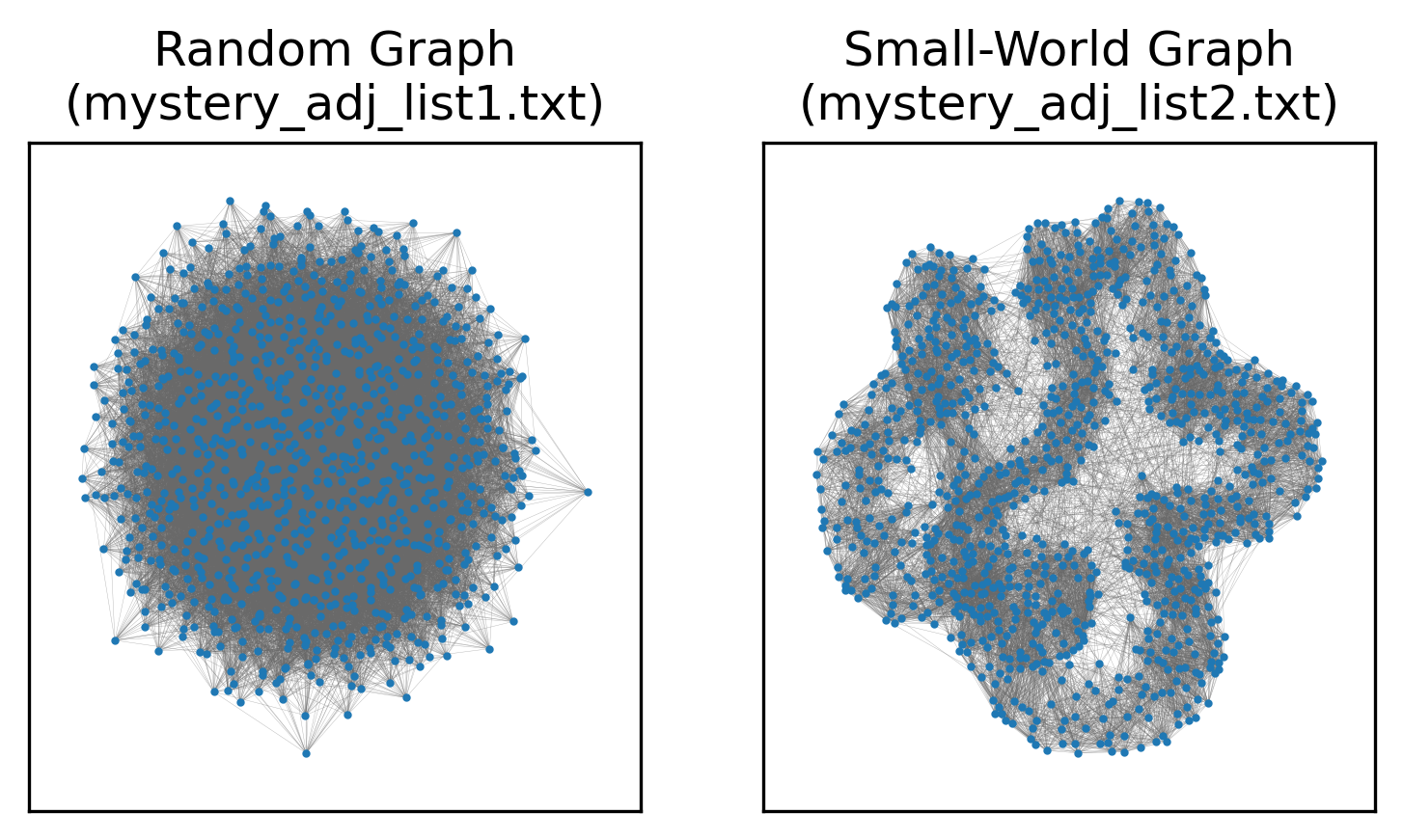
These tools are sufficient to take a mathematical model for network generation, calibrate it to real-world data to find the parameters most likely to yield the observed network, and then used the tuned model to determine whether the network was plausibly generated by such a model. This can help us categorize networks and definitely say “this network is not random,” “this network may have a powerlaw degree sequence, but has structure that is decidedly not explained by the preferential attachment of the Barabasi-Albert model,” and so on.
In the next post, we will explore inferring what edges in a network might exist by applying statistical analysis to observations of interactions.
Section 230: A Primer
Posted 12/13/2025
Senator Whitehouse (D, RI) announced that he’s moving to file a bill to repeal Section 230, the singly most important piece of Internet legislation, which goes on the chopping block a few times a year. While Section 230 is flawed, repealing it without any transition plan in place would be a civil rights disaster. Many have written articles about it. This one is mine.
Who is responsible for the Internet?
The core question is who is legally liable for content posted online, and what responsibility do social media platforms carry for the content they distribute? We have two analogies to draw from:
-
A newspaper. When a newspaper publishes an article, they bear legal responsibility for distributing its contents, and can be sued for libel. Even if the article is written by someone outside the paper, the newspaper editor chose to print the article and so accepts some responsibility for its dissemination.
-
A community tack board at your local coffee shop. Anyone can walk in and tack up whatever they want on the board. The coffee shop owner does not immediately bear liability for what members of the public have put up on the wall, and shouldn’t be sued because a patron tacked up a hateful or libelous message.
So which category does the Internet fall into? When someone posts a video or comment on YouTube, Instagram, Facebook, and so on, does the platform bear responsibility for distributing that content to others?
Before 1996 the legal standard used to rest on whether the platform exerted editorial control. If the platform had content moderation, then they chose what to remove from their platform, and implicitly what to leave up. If the platform had no moderation whatsoever then they could claim similar immunity to a coffee shop as passive facilitators. This meant that Internet service providers were legally in the clear - they fall in the same category as phone companies or the postal service in that they facilitate your communication without being a publisher - while forums and chat rooms were treated more like newspapers. As the Internet grew, this position became untenable: a human moderator can’t approve every Tweet and YouTube video before they go live, and these services can’t exist if social media companies accept legal liability for what every user posts online.
Enter Section 230 of the Communications Decency Act of 1996, which clarifies:
No provider or user of an interactive computer service shall be treated as the publisher or speaker of any information provided by another information content provider.
In short, platforms aren’t responsible for what their users post. There’s a short list of exceptions - platforms are required to take down material violating federal criminal law, copyright restrictions, or human trafficking law. Online services that exist to facilitate illegal transactions are also still vulnerable, so an online drug market can’t claim that they’re not responsible for all their users buying and selling drugs. But in general, this law allows social media to exist, allows any user-submitted online content to exist, and allows platforms to enact content moderation without automatically claiming legal liability for everything they host.
What’s wrong with 230?
A common critique of Section 230 is that it goes too far: platforms bear very little responsibility for the content they host, even if that content is hateful or harmful. For example, it is exceedingly difficult to sue Roblox for endangering children, even though it’s well documented that predators use their game platform to groom and harm children, because they aren’t responsible for what their players post. It is likewise very difficult to hold Meta accountable even when their own research showed that their platforms were dangerous for young people.
While Section 230 means that platforms can moderate content as they see fit, it also means that they don’t have to. The only real incentive platforms have to moderate content at all are market incentives: if a social media platform becomes a vile cesspool of hate and harassment, users may eventually flee to greener pastures that promise to keep out the Nazis. Unfortunately, switching costs are high: if I leave Twitter, I lose all my Twitter follows and followers. Even if those users have also migrated to Mastodon or Bluesky, there is not an easy way to re-establish those relationships en masse. So things have to get pretty bad for a critical mass of users to leave a platform, meaning in practice there is little pressure for the big players to moderate anything at all.
As we face more misinformation, more hate and harassment, and more AI slop online, it’s understandable that people cry out for the government to do something to pressure companies and improve our online spaces.
Why do we still need 230?
Unfortunately, simply repealing Section 230 would immediately destroy the Internet as we know it. Social media platforms like Reddit, Facebook, TikTok, YouTube, and Twitch could not exist. Collaborative writing projects like Wikipedia could not exist. Services like reviews on Google Maps or Yelp or Amazon could not exist, nor could Patreon or Kickstarter - any service where users contribute content could only continue to operate if a company moderator first examined the content to be sure the company wouldn’t be taking on unacceptable legal risk by distributing it. A blog like mine could survive because I don’t have a commenting system at time of writing, but that’s as close as we’d have to the Internet we know.
Technically, these platforms could continue to operate without any moderation, arguing that they’re just a passive conduit for users rather than publishers. However, given the sheer number of spam bots online, removing all moderation would also doom online platforms to collapse.
Why does this keep happening?
Every time there’s a new story about teen self-harm, or mass shooters radicalized online, or a range of other atrocities, politicians are pressured to hold social media accountable. Republicans in particular would like to target social media platforms for “censoring right-wing voices,” a largely baseless conspiracy that is impossible to pursue because companies are free to moderate content as they see fit. While social media companies usually push back against attempts to repeal 230, some larger companies see an advantage in “pulling up the ladder;” operating an army of content moderators would be exceedingly expensive for Facebook, but impossible for its smaller competitors, solidifying a permanent monopoly.
Is there any alternative?
Not an easy one. We don’t want to hold platforms legally liable for everything that users post, whether through exposing them to lawsuits or through some draconian government censorship board. For all the many flaws of social media, it is also an outlet for political and cultural expression, a platform for organizing and spreading information outside of traditional corporate media publishing, and a means of finding and building community with others. Those are ideals worth fostering.
In my opinion, one of the best courses of action is to build online platforms that are not profit-driven. A profit incentive implies keeping moderation costs down, and keeping engagement up to drive advertising revenue. This can lead (often unintentionally!) to dark patterns like encouraging radicalization and ‘hate-scrolling,’ because seeing more extreme and angry content keeps people watching. These incentives encourage lax moderation that won’t drive away users and inhibit ad money. By contrast, a community self-run platform like Mastodon has no advertising, no recommendation algorithm, and no incentive structure except wanting to provide a community space. Self-organized social media brings a host of other challenges related to content moderation and sustainable finances, but these seem to me to be more approachable than curtailing the behavior of Meta or Elon Musk through changing federal law.